Wednesday, November 25, 2009

Guitar Project Part 3: The Body


It's time for a long-overdue update on the guitar progress. Here are my earlier posts for those of you following along at home:

Part 1: The Design
Part 2: The Neck

First up for the body: finding wood. Although my goal was to make a unique, new-to-the-world guitar, I smartly decided to stay conservative when it came to body geometry, wood choice, et cetera. Even experienced luthiers cannot fully predict what a guitar will sound like before it is strung up, so if i was to output a reasonably playable instrument, it would probably be best not to be too adventurous with my materials choices.

Since I've always wanted but could never afford a Les Paul, I chose a nice African mahogany body with a bird's-eye maple top. I found some mahogany on eBay and bought a nice chunk of bird's-eye from the local woodworking supply shop. Since I wanted a book-matched top, I ended up spending hours using a combination of table saws, hand saws, and planers to make this one piece of wood into two. The local woodworkers' guild was very generous with their planer, but it still took a LOT of elbow grease for me to make the bookmatching cut. Before doing anything else, I made a cardboard outline and mocked up the body with some hardware and a fingerboard. As always--I figured an early and rough mock-up would help me decide what to change. In this case, it looked pretty good, so I plowed ahead:


After gluing up the wood and cutting out a rough profile on the bandsaw, I was pleased with the result:

The next step was shaping the arch on top. Using my trusty microplane, I first turned the flat surface into three sloping planes to set the neck angle and bridge position correctly. Making paper templates for everything was very important. Next, I sloped all of the sides down to the correct position around the edges. This all went surprisingly smoothly, but my arm was starting to look like Popeye's by the end. Unfortunately, the arch does not look very exciting in pictures yet, so you'll just have to take my word for it.

After (carefully!) chiseling out the neck pocket, I could finally put everything together for the first time. This was one of several rewarding moments throughout the process that reassured me that this work was going toward an end:


The next steps were to bandsaw out the cutaway and drill holes for the pickups. In retrospect, I would have had a cleaner result using a router for the pickup holes, but my drill press + chisel method was just fine too. They're hidden anyways, so nobody will know... unless they read this. You can see some of the nice figuring on the wood in this picture as well:


I did learn my lesson with the control cavity--using a router and two templates for the main cavity and the shelf for its plate:


The binding was also a challenge. I used a Dremel tool with a special guide fixture from Stewart McDonald. Special credit goes to my dad, who convinced me against my will that a binding would be cool enough to justify the trouble.


Speaking of my dad, here he is holding the guitar after gluing the neck to the body:


At this point, I could not wait to string it up and start jamming. The remaining steps--wiring up the electronics and installing the bridge and tailpiece--flew by in a couple of days:


And voila! I strummed the first notes and it sounded and played way better than I had expected. All that's left is finishing, dressing the frets, and performing a few other tweaks. I am still undecided on the finish, so if anybody has ideas (preferably along with a sample picture), please post it in the comments.

Monday, November 9, 2009

Tape Dispenser Design Redux

I was feeling a little bad about my tape dispenser design being rather, well, bourgeois--so I decided to take another stab at it. This was also an excuse for me to play around with some of SolidWorks' sheet metal tools. Behold: a tape dispenser for the people!


This is a one-piece sheet metal design. The tape roll can be removed by squeezing together the protruding tabs. It comes in anodized aluminum and galvanized steel--mostly because these materials looked cool for the renderings. The drawing below includes the flat-pattern shape, in case you are wondering what the original cut-out would look like.

If anybody knows of an ongoing tape dispenser design contest, I would love to hear about it!

Thursday, November 5, 2009

Tape Dispenser Design

I'm not an industrial designer, but sometimes I like to pretend :)

Having gotten my SolidWorks CSWP-Surfacing certification this week, I was itching for a little project. Here are the results:


It's not very clear from the renderings, but the orange thing is made of rubber and pulls apart inside the tape ring for when you want to change rolls. The base is a cast metal with chrome plating and there is a rubber non-stick base.

Obviously this would be a rather expensive and non-green product. But I had lots of fun modeling it and would love some feedback on the design.

Monday, November 2, 2009

Get Some Perspective!

It's surprisingly easy to forget that this exists.

Thursday, October 29, 2009

Moving to WordPress

A heads-up:

I will be moving this blog to WordPress soon because their platform is much more flexible. The new site will still be accessible from http://benjaneering.com, and will preserve all of the old posts and comments. In addition to the blog, I will also be adding new pages about my design work--with the intention of turning Benjaneering into more of a webfolio.

Stay tuned for the switch.

Tuesday, October 27, 2009

Guitar Project Part 2: The Neck

With the specifications in place, it was time to start getting my hands dirty. I will try to keep this post brief, but I would be happy to share more of what I learned if anybody has specific questions.

My friend Will generously permitted me to salvage components from a very cool looking but irreparably damaged guitar of his. Besides a usable truss rod and some cool-looking knobs, it was great to have this around for reference and reverse-engineering purposes.


I decided to start with the neck, since it is the most dimensionally critical and easy to mess-up part of the guitar. I had chosen to make the neck out of maple because it is stronger than mahogany, allowing a thinner design without worrying about the truss rod breaking through the back.

To make the neck blank, I cut up a long plank of nice-looking maple (from a local lumber yard) and laminated it three wide. Laminating provides extra strength, since the grain runs in slightly different directions in each section. After laminating, I routed a channel for the truss rod.

Here you can see the neck blank with the truss rod loosely in place:


To add some additional thickness where the headstock would be, I glued two more pieces of maple to the sides, making it five wide. The next step was to cut out the profiles--vertical and horizontal--on a band saw. The band saw I was using needed quite a bit of setup and a new blade. I spent a good amount of time getting to know the saw before making the cut, because this step was critical and cutting through 3'' of hard maple is not a trivial matter.

Fortunately, everything came out great. Before attaching the fingerboard, I would need to drill the access hole for the truss rod and cement the rod with epoxy. "Hey!" I thought, "this is starting to look like a guitar!"


I had originally planned on making the guitar entirely from scratch, but I quickly realized that buying a pre-slotted fingerboard was the way to go. Accurately shaping and slotting my own would have required a significant investment in tools and time. Also, if I screwed up the fret spacing even a little, it would render the guitar unplayable. So I was happy to buy a pre-slotted rosewood fingerboard (pictured above, next to the neck) from Stewart-MacDonald.

Now for the fun part: shaping the neck. There really isn't much of a science to this; I shaved it down to a slightly asymmetrical profile that felt good in my hand. I started at the ends and then worked down the middle, checking the progress periodically with a straightedge.

For this task, my Microplane was my best friend. These are also great for grating cheese, but I wouldn't recommend using the same blade.


Next up: fretting. Although I can't really know how good my fretting job was until the guitar is finished, this step seemed easier than I had anticipated. I cut the frets and bent them by hand with pliers, and then gently hammered them into the fingerboard. Filing down the ends took a little while, but the process was ultimately nothing to fret about (lame pun intended).


If I were planning on making fret marker inlays, it would have been easier to do this before installing the frets. I may change my mind at some point and put inlays in, but I think the fingerboard looks rather nice naked. I'm not big on needless ornamentation. Side dots, however, would be necessary for playability. These were a breeze to make: simply drill holes in the fingerboard, glue in a plastic rod, and cut it flush.


At this point, the neck was pretty much finished. I was very pleased with my success, and with the amount that I was learning about guitars and woodworking. So much for keeping this post brief! Stay tuned for progress on the body.

Monday, October 26, 2009

Guitar Project Part 1: The Design

Working at SolidWorks, I see CAD used for all sorts of cool things on a daily basis, so it didn't take long for me to start itching for my own design project. One day this summer, I (literally) woke up and decided that I was going to design and build an electric guitar. My goals were threefold:
  1. Teach me some new CAD tricks
  2. Teach me about woodworking
  3. Make something totally badass that I could rock out on, for less than buying a new instrument
Knowing essentially nothing about the luthier's trade, I first had to read up on the topic. It didn't take long for me to find "the bible": Melvyn Hiscock's Make Your Own Electric Guitar. I read this cover-to-cover before attempting anything else, and I highly recommend that anybody undertaking a similar project do the same.

Other indispensable resources include the Project Guitar Forum, and of course Stewart-MacDonald--the bane of my wallet, and the ultimate luthers' porn.

Based on my reading and a close examination of friends' Strats, Les Pauls, et cetera, I started the CAD mock-up. This was both incredibly fun and incredibly nerve-wracking. There are tens of absolutely critical dimensions, and nearly all are dependent on each other and on the bridges, pick-ups, frets, nuts, and tailpieces that you will buy. For anybody who has ever sketched out the body shape of their dream axe, know that designing a guitar from the ground up is an engineering project in the truest sense.

Anyways, here are the initial results (click to expand):


Not my best rendering efforts, but the model files were unfortunately lost in a poorly executed hard-drive replacement. The lesson, as always: back up your stuff!

Fortunately, I did have a chance to print out a totally sweet 1:4 scale stereolithography model:


Cool, huh? Stay tuned for part 2 :)

Friday, October 16, 2009

Tuesday, June 23, 2009

Fidgeting: An Update

As a response to my April post on Fidgeting, Tracy (co-creator of the awesome travel blog the195.com) pointed me to an interesting Wired article on a paper about the cognitive purpose of doodling. Here's the link:

http://www.wired.com/wiredscience/2009/02/doodlerecall/

Here's an excerpt in case you don't want to read the whole thing:

"Andrade’s team asked 40 people to listen to a recording containing the names of people and places. Afterwards the people wrote down the names they could remember.

While listening, half of the test subjects were also required to shade in shapes on a piece of paper. Afterwards, they remembered one-third more names than test subjects who didn’t doodle while listening"

Just as I had suspected, based on my own extremely unscientific self-observation! Based on the paper's hypothesis, these results should apply not only to sketching, but also to other "small cognitive load" activities, e.g. fidgeting with a paperclip.

Thanks, Tracy!


Original Paper: "What does doodling do?" By Jackie Andrade. Applied Cognitive Psychology, Vol. 23, No. 3, Feb. 26, 2009.

Update from Molly's Cupcakes

Friends,

My apologies for the infrequent posting. Since my last update, I have become a MASTER OF SCIENCE, and am now fully qualified to do... well, I'm not quite sure what exactly, but I definitely feel smarter. Now that my schedule is a little less hectic, I will hopefully have more time to do some writing.

Thank you to everybody for the feedback on the alarm clock design. It seems to be quite a passionate subject for many of us, and there are clearly some good designs out there that have yet to be created or adopted-- despite the wealth of effort that has been put into the subject. While a better alarm design may make make my life better in the long run, I'm thoroughly enjoying my current streak of not having to use one.

Monday, May 4, 2009

Alarm Clocks


In my bedroom there are five devices with alarm clock capabilities: two regular alarm clocks, a cell phone, a laptop, and an mp3 player. None of these devices are particularly reliable or easy to use and they all function differently. With many of them, setting an alarm--a task that many people need to do daily--is as difficult as setting the clock on a DVD player or microwave.

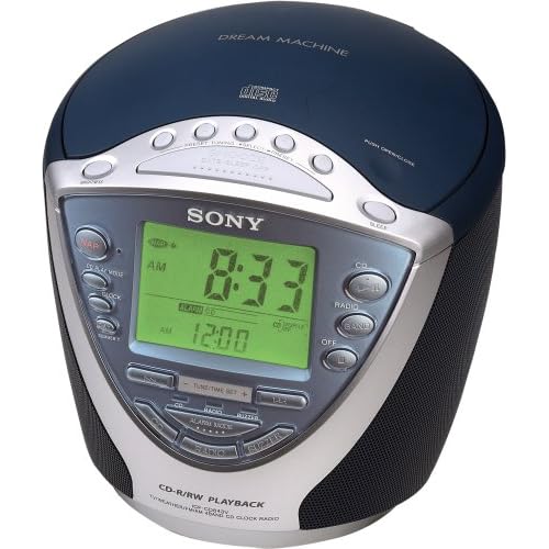
My Sony Dream Machine ICF-CD843V (shown above) is the best among these evils. A quick look at its Amazon listing reveals many of its problems. One reviewer submits this one-star entry:

"I NEED SOMEONE TO TELL ME HOW TO SET THE CLOCK RADIO. I PRESS CLOCK ON THE SIDE BUT NOTHING HAPPENS AFTER I PRESS THE UP AND DOWN BUTTONS. HELP!"

There's even a post on eHow.com explaining how to set the alarm. And this is the best of the five options that I own! But for an experienced user such as myself, knowing how to set an alarm is not the problem. The problem is actually doing it.

Last Tuesday, I slept through a class presentation because I had failed to notice that the alarm was set for PM instead of AM from the previous day's afternoon nap. While this problem is rare, it consistently happens to me at least once every few months. This is not an acceptable failure rate; I need an alarm clock that I can trust to work every time. Nor is this problem the user's fault; the alarm time's AM/PM marker is tiny and is not located in the standard position after the time. Go ahead and see if you can find it in the picture above. Now pretend that you're exhausted and it's dark in the room. Not easy, is it? (hint: it's to the left of 12:00)

One solution to this problem, discussed by Don Norman in The Design of Everyday Things is to use 24-hour military time, or (even better) metric time. But standards should rarely be ignored in cases like this. A user seeing 21:00 may be confused or think that his alarm clock is broken. Worse, a user wishing to nap until 8:00PM may just set the alarm for 8:00 military time and sleep until the next morning.

Another possibility is to employ a forcing function, whereby users are required to hit either an AM or PM button after entering the time. This forces the user to consider which time has been selected, rather than relying on the previous time to be in the correct 12 hour ballpark. This is surely a better solution than the existing system, but there's always the problem of hitting the wrong button by accident. Tired users are particularly prone to errors such as this, but at least this solution provides a pause for people to consider the AM/PM decision, preventing them from skipping over it.

My best idea that so far is a slider design:

As you can hopefully see (sorry for the crappy jpeg; Blogger is giving me problems), the alarm time is set by two sliders: one for hours, one for minutes. The hour slider clicks at discrete intervals, while the minute slider can be adjusted continuously. A switch and corresponding LED activate the alarm and provide feedback. In the picture above, the alarm is set for 6:38AM.

This design eliminates the need to distinguish between AM and PM, since the slider covers an entire day. It is also very fast and intuitive to set. A snooze feature could either be implemented in the traditional way or a user could simply adjust the bars for another 10 minutes of sleep.

I'll be the first to admit that this design isn't perfect. First, I wasn't sure whether to include 12:00AM and :00 respectively at the end of the sliders. I could easily see a user setting the alarm for 6:30AM one day and then moving the minute slider all the way to the right the next day, intending to set the alarm for 30 minutes later. This problem could probably be fixed by ending the sliders at 11:00PM and :59, respectively.

Second, this design does not address countless other problems with alarm clocks. One common issue is accidentally turning off the alarm without waking up. There are lots of fun designs that try to address this problem in some pretty creative ways. I haven't addressed these here, though.

Anyways, I'd appreciate some feedback! Can you see any problems with the slider design? Do you have alternative ideas? Insightful stories about bad alarm clock experiences would be appreciated as well.

Wednesday, April 29, 2009

Misdirected Text Messages: Volume 2

For an explanation, and for Volume 1, see the original post from February, 2009. I've found recently that the grammar, punctuation, and capitalization of these messages has been getting better. This may be correlated with the widespread adoption of smartphones with keyboards.

Apr 26, 2009 9:09:56 PM
From: 6174489502@VTEXT.COM
Oh God Im starting not to feel right again and Lisas having health problems again Stop over doing it with your back

Apr 26, 2009 8:12:43 PM
From: 2086807024@VTEXT.COM
FWD: FWD: -Fwd: What's 7 inches long, inside a man's pants, has a big head on it & women love to blow it? Yep, money. Keep this going pervert!! lol

Apr 26, 2009 2:57:30 PM
From: 2567101031@VTEXT.COM
at a funeral. going to cemetery. will call

Apr 24, 2009 11:07:42 PM
From: 5415302609
kickin it with. every one else tell me the So far just me n this pro skater guy that i been kickin it with. every one else tell me they dont have a deat

Apr 19, 2009 7:43:34 PM
From: 4802762205
busy today another night my ex will not he can we reschedule? ex being an ass again need to get my kid soooooo sorry!


The design process: Part 1

Unlike the scientific method, the design process is not a well-defined thing. Most design professionals have a preferred process, and many are quite stubborn about theirs being the right one. Usually, there is some good logic to a well-developed process, but I've always had trouble taking people seriously when they claim that theirs is the only way to do things. Based on my admittedly limited experience, the most accurate representation of the true process is something like this: (Creative Commons, Damien Newman)


In his book Designing for Interaction, Dan Saffer describes four distinct methods for design: User-Centered Design, Activity-Centered Design, Systems Design, and Genius Design. Without going into the details of each of these methods, suffice it to say that they are quite different. As far as I can tell from what I am being taught at the Segal Design Institute, User-Centered design is the hot one right now. UCD places the user at the center of the process, and allows a design to form and be refined based on the needs (latent or expressed) of this user.

Of course, as Daniel Nettle explains, humans are notoriously bad at knowing what will make them happy. This presents a problem for the practitioner of user-centered (or human-centered) design. Because of this, rather than simply asking people what they want, a designer needs to make rather unscientific inferences based on ethnography and a slew of other observational data-gathering tools.

From this qualitative data, design concepts somehow emerge. But how? Designers are typically encouraged to shelf their own personal biases and prejudices in forming conclusions from what they see in the field. But the real world seems a lot more complicated. From a given set of observations, there are infinite conclusions to be drawn. How the data is clustered, what meaning is ascribed to it, and what initial solutions are proposed will all be different with a different set of designers working on the job. This is ostensibly a good thing (there's more than one way to skin a cat, after all) but this is the time that those latent prejudices can slip back in.

Designers are people too, and all people have their own agenda. For an academic project, the goal is to get a good grade; for a client, it is to impress the client; for a business, it is to make something marketable that fits within the constraints of the company's structure and culture. How can a designer avoid pushing their interpretation of the data--and thus the initial design concepts--toward meeting this unrelated agenda?

Why not embrace the fact that designers have biases? It seems logical that the more you try to keep yourself out of something, the less you understand how you're skewing the results. There must be a better way of doing things.

More on this to come.

Monday, April 20, 2009

A Sign


Something struck me about this sign. It's just so... simple! Easy to read. Easy to interpret. Attractive. No logo or trademark to clutter it up. Durable.

So what if it's not multilingual? So what if there isn't braille or a 'pool' icon, or a map of the building with a 'you are here' and directions to the pool. Maybe it's not as functional as it could be, but who cares? I'm sure the designer didn't put a lot of thought into the creation of this sign--it was likely a standard design, ordered for a hotel chain in bulk as an afterthought. Maybe that's why it's so simple and straightforward. Contrast with this:


This is the device used for trivia games at The Spread--a bar near my apartment in Lincoln Park, Chicago. In theory, the trivia games are a good idea: questions are put up on a TV screen in the bar, and groups designate a person to quickly enter the correct answer into this device. People compete not only against other groups at the bar, but against other bars across the country as well, with the winners receiving free drinks or other rewards.

There are obviously many more constraints on the design of this object than the pool sign. It has to be rugged and waterproof, and it has to support a vast array of functionality. To use, however, it is a nightmare. Imagine being delegated by your friends as the data entry person for your trivia team. First of all, no instructions are given as to how to set up the device, enter your team name, or respond to the questions. Do you type your numerical answers in the number pad on the right, or in the numbers above the keyboard? Do you have to lock in your answer, or does it automatically send it in once you type something? How do you correct a typo? These are not trivial (pun intended) issues, especially considering that most users are a few drinks in and have five or six people screaming answers at them simultaneously.

If you know how to use it, the device functions very well. It's always charged (there is an easy to use docking port), the wireless signal is strong, and you don't have to worry about spilling a drink on it or dropping it on the floor. But it has major feature creep, is ugly, and the membrane switches just don't feel right. I can't decide whether it was more likely designed by engineers or business people, but it is clear that no regard was given to its usability or aesthetics.

So both the sign and the trivia device likely had minimal thought put into their design. Why then is one pleasant and functional and the other ugly and abysmally hard to use? Is it simply because the second one is much more complex? It seems that simple things often suffer from over-design, and complex things suffer from under-design. An iPod is a classic example of a well-designed complex thing. I'll be on the lookout for an over-designed simple thing to round out this theory.

Monday, April 6, 2009

New Domain

Just to let you all know, this blog can now be reached from www.benjaneering.com. All of you enterprising readers who were scheming to buy the domain and sell it back to me after this blog blows up: your plain has been foiled!

Friday, April 3, 2009

Service Design: Pizza Delivery

I am a pizza snob. Born of New Yorker parents, I prefer the floppy thin-crust variety that is essentially impossible to find in Chicago. Having tried dozens of local pizzerias, Cafe Luigi has won a place in my heart as the best of all possible evils; so when going out to eat with friends, I will invariably push for a trip there.

While a trip to this establishment meets my needs on weekends when I have lots of time to go out for pizza, sometimes delivery is the best option. Unfortunately, like most mom-and-pop restaurants, the delivery service at Cafe Luigi leaves much to be desired. Having located their phone number, you call, carefully explain your order to a multitasking employee who barely speaks English, hope they write it down correctly, wait anywhere from thirty to sixty minutes, pay the delivery person an unpredictable amount of money, and enjoy your probably cold pizza. After going through this process twice (which indeed began to overshadow my multiple positive experiences going to the restaurant), I decided to give somewhere else a try.

Dominos is not well known for the quality of its pizza, but it is a large chain with ample resources to hone both its front-stage user experience and its back-stage operational efficiency. One night a few weeks ago, pressed for time and looking for a predictable low-stress option, my friends an I ordered Dominos delivery. My reaction: wow! Dominos.com, in particular the Pizza Tracker feature, is a refreshing solution to many of the service quality problems plaguing pizza delivery.

Once you place your order through the incredibly intuitive website (or over the phone, if you wish), you are directed to your personal Pizza Tracker timeline, which lets you know exactly what is happening with your order and almost as exactly when to expect final delivery. The feature gives a visual representation (see below) of your pizza's progress through the various stages of preparation and delivery. It also provides humanizing explanations such as "Alejandro put your pizza in the oven at 7:32pm" and a place for providing feedback on various aspects of the service.


The pizza tracker simultaneously provides a buffer, giving customers something to look at while waiting for their pizza, and concrete feedback on what is happening. It has low service intensity in the traditional sense, since you are not actually dealing with people (thus costing Dominos nothing), but it feels like a high intensity service because an incredible amount of information is being exchanged between the service provider and the consumer. It provides accountability, demonstrates low-variability in delivery time, and assures hungry customers that somebody is doing something about their order.

Thus, my new strategy: Cafe Luigi at the restaurant, but Dominos delivery.

Thursday, April 2, 2009

Fidgeting

Often when I'm on the phone or in a long lecture, I find myself fidgeting with something. Yesterday it was a disposable roll of double-sided scotch tape. Few of my plastic pen caps have pocket clips any more, as I have absent-mindedly twisted them off. I have no straight paper clips.

Doing this helps me focus. As long as it's not a particularly thought-provoking fidgeting object, using my fingers for something trivial provides just enough stimulation to focus my other senses on the lecturer or the phone conversation. Doodling serves the same purpose. Looking back on my old class notebooks, there seems to be a strong correlation between the number of doodles and the interest that I had in the class. The type of doodle also seems to matter; more abstract or thoughtless drawings (an array of cross-hatching, squiggles along the boarder of the page) tend to happen when I am interested in something but slightly too restless to just sit still and listen.

I frequently notice other people doing this too. What are some of your favorite mindless fidgets? Is this a bad habit, a good tool for focusing, or just an inescapable part of human nature?

Cat Tech helmet redesign featured on Discovery Canada

I'm finally back to Chicago after a couple of weeks on the road. It was a great, refreshing trip down to New Orleans, book-ended by weekends in St Louis and with a stop for lunch in rainy Memphis. Lots of great people watching, and it felt like summer down in Mississippi.

Now for a bit of shameless self-promotion; one of my projects was featured on the Daily Planet show on Discovery Channel Canada. I had worked on this helmet redesign two years ago with Pat Bell, Andrew Prince, and Joe Russino. This year, it got passed on to another team at Northwestern (including Sarah Hulseman) that is working on the airflow regulators.

My first time on TV! Check it out (begins at around the 8:20 mark)

Sunday, March 1, 2009

On the Road

I'm writing this post from the second deck of a MegaBus on route from St. Louis to Chicago. Isn't technology great? Anyways, it's been a fun (if unproductive) weekend. Baked some ciabatta bread from scratch and got a lot of cat hair all over me. It's always great to get out of the city for a couple of days, but it's hard to go back and pick up where I left off.


On the topic of brands and marketing, here's a fun exercise: make a list of all the brands of your surrounding possessions. Here's mine (in no particular order):

Apple, Arcterryx, Levis, Clarks, Calvin Klein, Keen, Champion, Bose, Gap, Visa, Coca-Cola, Blackberry, Wired.

Wow--I feel like such a consumer all of the sudden. What does this list say about me? If we are what we own (as John Zimmerman argued in his lecture last Tuesday), then who am I? Make your own judgments about what these things mean, but either way--that list is an interesting little summary of my habits, history, and personality. If you want, try it for yourself and post in the comments. I promise I won't judge.

Monday, February 23, 2009

Addicting flash games are an under-appreciated artfor

Now that I'm learning a little about flash programming, I am blown away by the design complexity and technical skill involved in the creation of simple games. One of the coolest collections (and most mind-blowing in terms of its creation) has to be Ferry Halim's Orsinal games. They're so simple and pretty, but their design and implementation must have been quite the undertaking.

Even more basic games such as Filler must have taken forever to create. How does a professional flash game designer make a living? Or is it truly an activity for amateurs with lots of spare time?

By the way, sorry if I just wasted an hour of your day by posting those links.

Sunday, February 15, 2009

Pride in your work

I am often depressed by the throw-away nature of most design work today.  Of course, almost everything is driven by economics, and the quality of the thought that went into the design of a product is usually lost in its marketing.  So frequently the product itself is secondary to its context; the design driven by avoiding the competition's patents, its features chosen by a committee of suits, its useful lifecycle (never more than a year or so at maximum) decreed by the inexorable encroachment of knock-offs and the waning patience of retailers.

So today when I was waiting for the train at the Quincy stop in the loop, I was pleasantly surprised to see this old promotion:

What pride in your design!  The Daisy Oil Can, its patent date proudly displayed on the top rim of the product (not just the number, and not hidden like on most products today), is hailed as a miracle of innovation.  Miniature people surround it, gazing longingly at its laughably oversized brilliance.  As far as I can tell, it is a glass-lined tin can which presumably does not leak as much as conventional all-tin cans.  But the damn thing looks like it's here to stay; the inventors have no shame in their sliced-bread mentality.  It's too bad that small victories are no longer deemed worthy of such celebration.

To see how far we've fallen from those glory days of wondrous invention, check out this depressingly right-on spoof from The Onion (foul language is potentially NSFW).

Tuesday, February 10, 2009

An idea

When Bruce Mao spoke at Northwestern recently, he discussed his frustration quantum leap between hiring somebody and not hiring somebody to your firm.  This resonated with me for two reasons.  First, for a company to take somebody on, they must be reasonably confident that it is a good long-term investment.  Companies usually cannot hire somebody for one specific project without a plan for the future; investment in training and an ongoing commitment to salary and benefits prohibits this.  Consultants and freelancers are available for particular jobs, but they are expensive and the pool of available consultants is necessarily smaller than the pool of qualified people who would like to (and are able to) contribute to a particular endeavor.  Second, as an unemployed person, I am finding it difficult to connect with a company that both suits my needs and is willing to accept my limited proven experience in the workforce.  If I did find such a company, in this economic situation I cannot even be sure that such a situation would be lasting.

So what to do about this?  There are plenty of people out there with ideas, and there are plenty of people out there with the ability to execute those ideas.  What if there was a service which would match up people with complimentary interests and abilities in order to do certain things?  A guitarist and a singer, an entrepreneur and a programmer, an engineer and a machinist, a designer and a marketer--all could meet and collaborate in a mutually beneficial way, contributing their work to society without the burden of a long-term economic commitment.

The idea is for a service in which people could post their own listing of ideas and the ephemeral gigs that could contribute to the execution.  Listings would consist of a short description of the idea--with an arbitrarily high level of disclosure--and a brief listing of what work the poster is looking for help on.  Along with this, he or she might provide a starting point for negotiations on the ownership for the concept--likely as a portion of the project's equity.  Then, anybody with the talent and desire could get in touch with person and hopefully begin a collaboration.  

One problem that I foresee with this model is people stealing others' ideas.  There are two ways to prevent this: only disclose publicly as much as you feel comfortable with, and fully document and archive all correspondence.  If somebody were to steal and attempt to patent a concept from the program, it would be well documented (through the initial posting and ensuing correspondence) where the idea actually came from and who came up with it.  In essence, I envision the exchange of ideas provided by this system to work more like the science world than the business world--where progress and knowledge well documented and credit for innovation is systematically distributed according to prearranged metrics and relationships.

An existing example of this crowdsourcing business model is the site namethis, where everybody is encouraged to contribute ideas for the name of something and the winning entry (as decided by the poster) gets compensated.  Why couldn't this model work for more expansive projects?

In the spirit of the idea, I would like the development of this service to be a sort of proof of concept for the service itself.  If anybody believes they could contribute, I would love to hear from you.  I am in the greatest need of somebody with web programming abilities and somebody with marketing abilities, but I would love to hear from anybody with suggestions or opinions about any part of this.

Wednesday, February 4, 2009

Flash prototyping for interaction design

For all you EDIers out there, I found a pretty useful tutorial for learning Flash for interaction design prototyping.  I went through it last night, and it does a good job of explaining not only some simple ActionScript commands, but also some of the logic behind what you're doing. 

Hope this helps!

Monday, February 2, 2009

Misdirected Text Messages: Volume 1

[Ed. Note: Post originally written over the summer; content still holds true; will follow up soon.

For years now I've been the recipient of SMS messages intended for other people on a multi-daily basis. The messages represent a seemingly random cross section of all the correspondence that passes through Verizon's system; there is no pattern in the senders or the messages themselves. Not once have I received a solicitation of any kind, so it seems unlikely that this is "spam" in its normal form. The senders are always different-- sometimes from phone numbers and sometimes through Verizon's VTEXT.COM address-- and the messages are as varied as they possibly could be. On occasion, I've tried responding to a text, but I've never gotten a clear answer. It's quite annoying.

Anyways, I can't decide what else to do with these messages, so I'm going to post some of the more interesting ones here on an ongoing basis. There's no real point to this, but I hope that somebody finds it amusing.


Mon, Jul 14, 2: 37 pm
From: ONEMARTIALARTIST@VTEXT.COM
He says yes to that if Any swelling or pain exists 24 hrs after metoral dose pack is over.That treatment is ordered on Standby anytim
Troy

Fri, Jul 11, 9:48 pm
From: 415-302-3587
Hi - been running around lk a banshee oday. Wish u wr only 3 hrs diff- need a shouldr- bn a tf day n wshd i was outta here already. L try 2 call u tmro

Thu, Jul 10, 2:06 pm
From: 404-227-4548
with a woman in this culture is not possibility for me because of cultural differ's. i been with o

Wed, Jul 9. 12:01 pm
From: 503-930-5457
throwing up earlier trying to get ready now

Tue, Jul 8, 9:40 pm
From: 425-698-3498
yes is ok i want to shop here a little to try and find size 11 shoes...did you get my money message...how much was the flight

Sat, Jul 5, 9:17 pm
From: 4147597970@VTEXT.COM
Thats cool though. You can get a hook hand and join your mom as a pirate. Hopefully a bottle rocket will take out your eye tonight.

A Revolution in Design Research

Last Thursday, I attended a lecture by Jodi Forlizzi about her research at CMU on human-computer interaction and her thoughts on the ongoing "revolution in design research." The revolution, as I understand it, has to do with design research becoming a better respected and defined method of developing products and aiding in the scientific process. The crux of her definition of design research is that it is a seach for the "real," whereas conventional scientific research is the search for the "truth."

Dr. Forlizzi focused the second half of her talk on a project called the "SnackBot" which, as you could probably guess, is designed to bring snacks around to people at CMU. There seems like a lot that you can do with a SnackBot, and parts of the design seemed well grounded in the ethnographic study of people's snacking habits. Of course, as she was describing her research insights and challenges, and how they led to a humanoid form of certain proportions and abilities, I couldn't help but think of this:


Rosie Jetson is the ultimate snackbot. While I don't mean to dimish the work of Dr. Forlizzi or others working in the robotics field, who would have guessed that given the technological revolution of the past few decades, we are not even close to making something with the abilities of this 1962 Hanna-Barbera conception. Not to say that having a fleet of maid-robots wheeling around our houses would be a good thing, but I feel like we've been promised these household humanoid robots for decades, and it seems like it's never going to happen. When will I have a comprehending metal assistant to perform all of my menial tasks for me? Is this the ultimate goal that is driving robotics specialists to create such things as SnackBot?